The Why Behind the Design
I get the opportunity to work with so many wonderful people, and incredible projects. Here’s an inside look at why each element was chosen, and how detailed and thoughtful I try to be with everything I create.
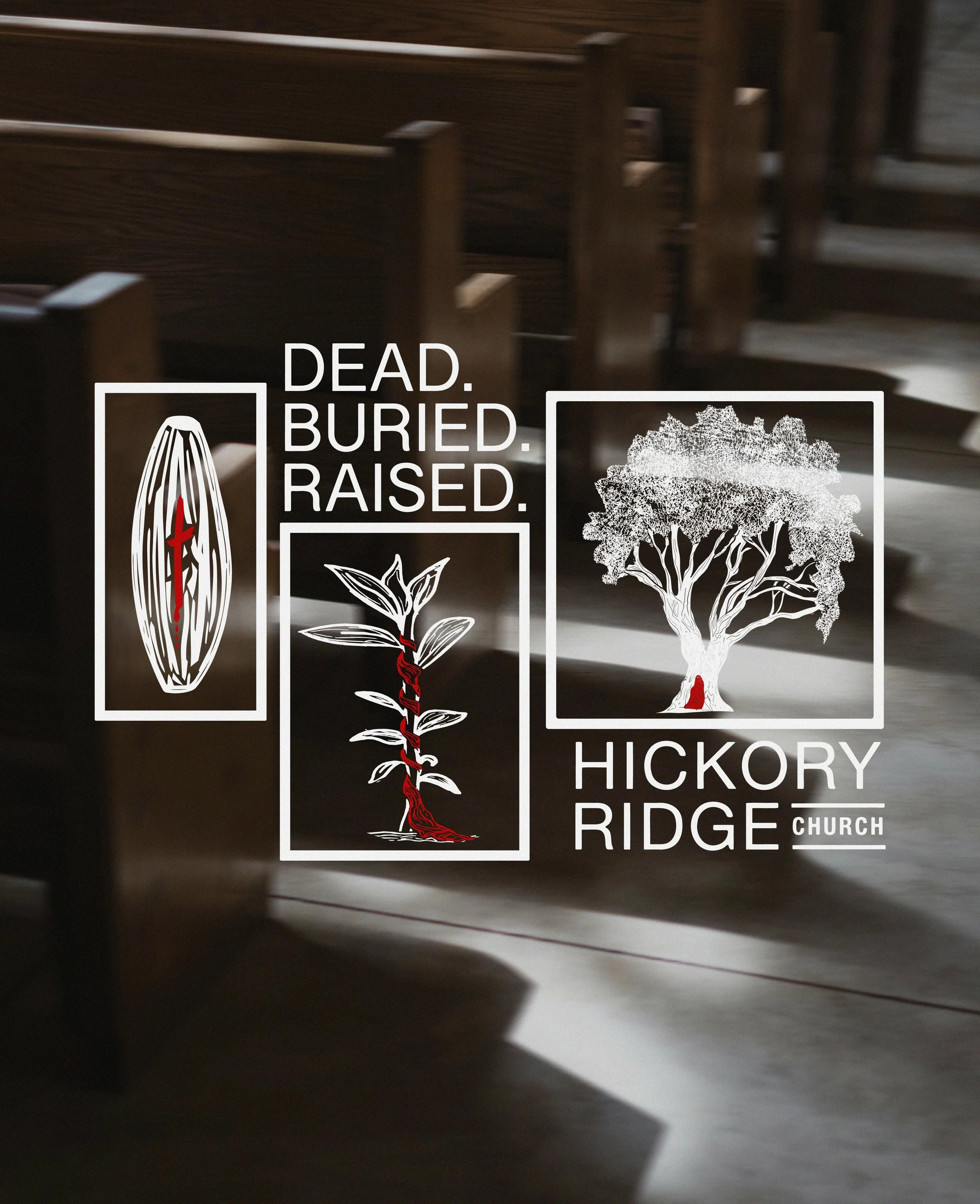
Shirt Design for Hickory Ridge Church
The original idea was simple:
A seed. A plant. A tree.
“Dead. Buried. Raised.”
But I wanted the entire piece to feel like the resurrection story was woven into it.
Every part of the design points back to the crucifixion, burial, and resurrection of Jesus, while also reflecting Romans 6:4-6. That through baptism, our old selves are buried with Christ, and through Him we are raised into new life.
The seed contains a cross with blood beneath it, and the sharp edges throughout the shape are meant to resemble thorns. It represents death. Not only Christ’s death, but our old selves being crucified with Him so that sin no longer has power over us.
The plant is wrapped in linen, reflecting the burial cloth Jesus was wrapped in after the cross. It points to the burial. The laying down of the old life.
Then the tree becomes the image of resurrection.
It is actually drawn from an olive tree in the Garden of Gethsemane. Hidden within the center is Christ walking out of the tomb, and every leaf was formed by hand-writing John 19 and 20, the full story of the crucifixion and resurrection.
In the same way Christ walked out of the grave, baptism becomes a picture of us rising from the water into the new life God has for us.
Even the choice of an olive tree was intentional.
Olives are crushed to produce oil, and there was something beautiful to me about that parallel. The life we step into through Christ is full of beauty, purpose, and renewal, but sometimes this walk with Him can still feel crushing. Even so, we can take heart because He has overcome the world
“For we died and were buried with Christ by baptism. And just as Christ was raised from the dead by the glorious power of the Father, now we also may live new lives” Romans 6:4-6

“Our Story His Glory” Shirt Design
I created this piece for Go Ministries in the Dominican Republic as a team shirt design. The heart behind it was to visually represent the Holy Spirit in a way that tells a deeper story.
At the top, you’ll see two doves, referencing John 1:32 and the Spirit descending like a dove. In the center is fire, inspired by Acts 2, where what looked like flames rested on each person as the Holy Spirit filled the room. And if you look closely, the entire stained-glass design subtly forms the face of a lion, pointing to Jesus as the Lion of Judah in Revelation.
The message behind this design is simple: When we allow the Holy Spirit to move in our lives, transformation happens. Sometimes we don’t even realize it at first, but we begin to look, speak, and live more like Jesus.
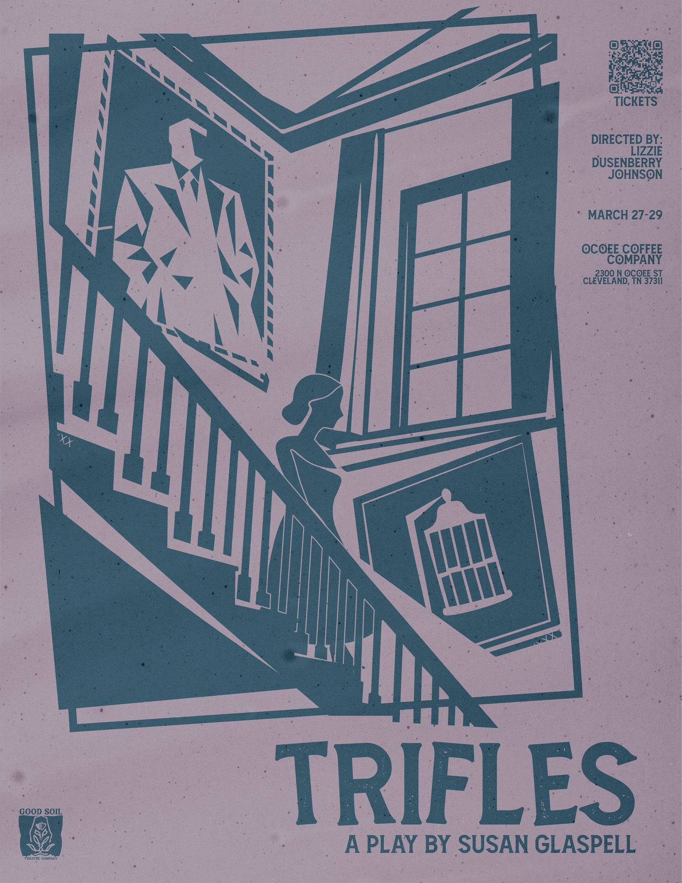
Trifles Poster for Good Soil Theatre Co.
A murder mystery set in the early 1900s in which the wife is the culprit. For this poster, I designed her with soft curves and no sharp edges to represent her perceived innocence and traditionally feminine gentleness. In contrast, the husband is composed entirely of sharp edges, symbolizing his harshness and lack of compassion, even toward his wife.
The birdcage, a crucial element in the play, is what ultimately pushes the wife over the edge. Although it is her bird, the cage itself is a mix of sharp angles and soft curves, representing how she has absorbed her husband’s cruelty and crossed the line into committing an unthinkable crime.
The overall composition moves in conflicting directions, subtly suggesting that something is deeply wrong within this household. Lastly, the color palette is sourced from an early 1900s house catalog as a nod to the time period.

Mosaic Designs Logo
Mosaic Designs was created for a web design company that wanted a visual identity inspired by the beauty and structure of stained glass. The goal was to develop a logo that feels intentional and intricate while clearly communicating the brand’s core values of strategy, collaboration, and a strong connection to local businesses.
To represent strategy, I incorporated the queen chess piece, symbolizing intelligence, versatility, and strength as the most powerful piece on the board. A location pin highlights the company’s focus on serving local businesses and building community presence. I also introduced four-petaled floral elements as a meaningful detail, inspired by the Hebrew symbolism of the number four, which represents new beginnings. This reflects the transformative role the company plays in helping clients enter and grow within the digital space.
An angel element was included to reflect the client’s faith and to emphasize that the business is centered on and guided by God. The lettering is intentionally abstract, reinforcing the stained glass concept and allowing the typography to feel integrated into the overall composition, as if it is part of the window itself.
The final design brings these elements together in a cohesive stained glass inspired composition, balancing symbolism with clarity to create a thoughtful and purposeful brand identity.
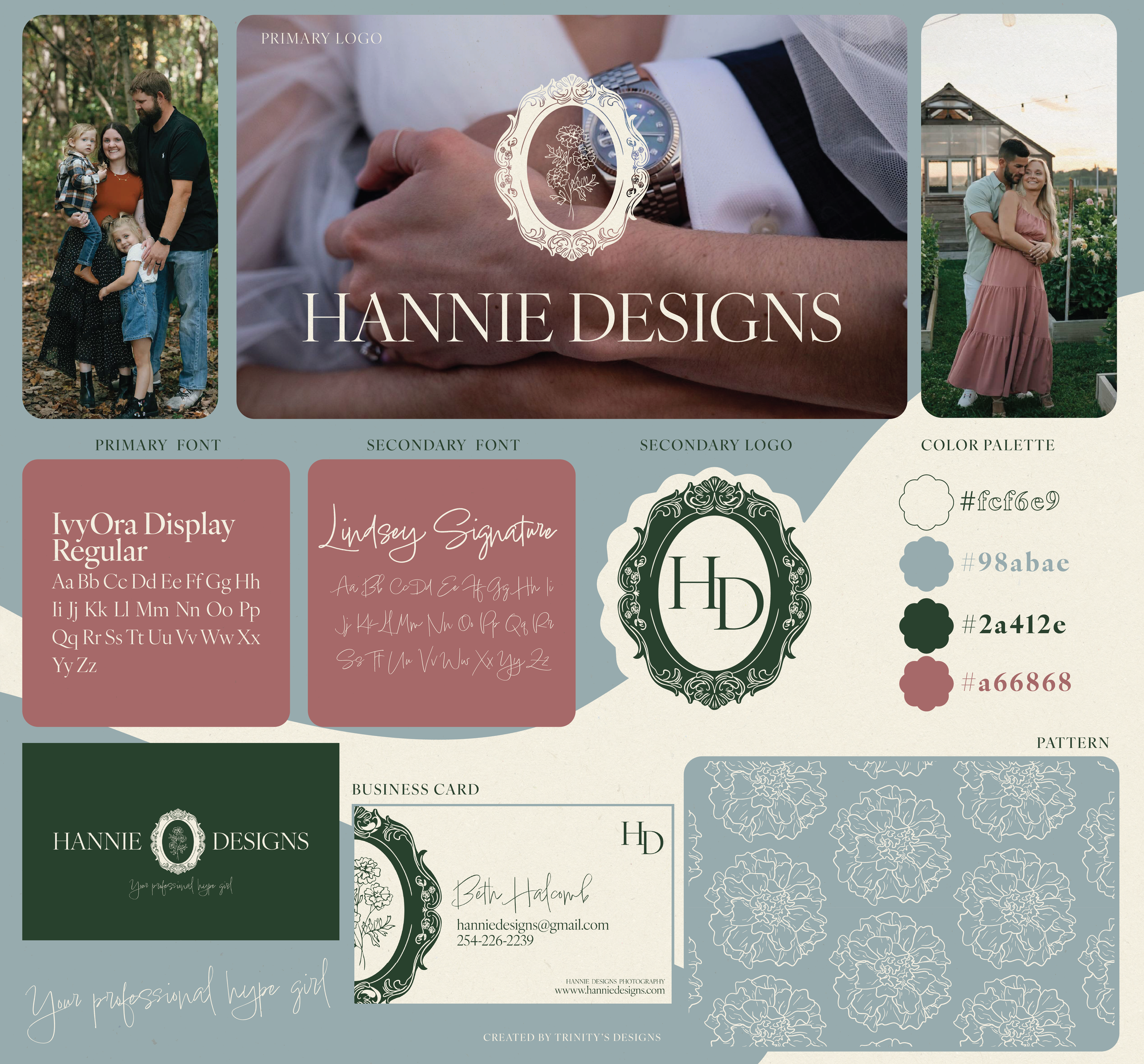
Hannie Designs Logo
When I talked with Beth, she shared that her goal was to create “heirloom photos” for her clients. That vision shaped everything. The main icon sits inside a photo frame to guide the viewer toward seeing her work in that timeless, keepsake way. The marigold at the center represents joy, creativity, and warmth, which are all qualities Beth hopes people feel during their shoots.
The color palette came directly from her own photos so her brand stays cohesive without extra effort, plus a soft pink she hoped I could add in.
Cultivate Counseling Logo
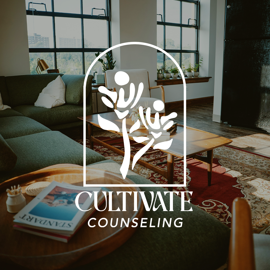
Cultivate Counseling is a logo I designed in 2024. The design features two flowers forming the shape of a hand, symbolizing the role of the counselor as a supportive presence that helps guide and build people up. The hand represents collaboration and care, emphasizing that growth is not a solitary process but one that happens through connection and trust.
The flowers also represent the individuals themselves. As clients grow, learn, and talk through their experiences, they are nurtured into becoming their fullest selves. The design reflects the idea that healing and personal growth take time, patience, and support. But through the work, as they cultivate growth, their lives can form something beautiful.